Time Series Forecasting
EDA & Data Preperation
Time series analysis is a very useful tool businesses can use to assist in their deicsion making process. We all know that “No model will be 100% accurate but some models are useful.” There are numerous time series methods and techniques that can be used but for this example we will be utilizing Business Science collection of open software packages. Although after recently attending the RStudio Conference the tsibble and fable package could be used for this analysis as well. The concepts I use when beginning any type of data analysis come heavily from Hadley Wickham and Garrett Grolemund’s R4DS. The analysis pipeline that I follow always begins with what is the business task at hand, what data science tools can help tackle, and what question do we want to have answered? The process is straight forward and usually leads to more questions, insights, and steps to take towards achieving an actionable outcome.
The business problem is to estimate future super bowl ticket sales. Using past sales, the data can help improve forecasts and generate models that describe the main factors of influence. We can then use the analysis to develop actionable outcomes based on what we have learned. The first step is loading our packages and reading in the data. Usually I would be reading data from a database but for clarity and simplicity we will read in a csv file.
library(tidyverse)
library(lubridate)
library(timetk)
library(tidyquant)
library(broom)
library(modelr)
library(caret)
library(gridExtra)

SB <- read_csv("SB.csv") %>%
  mutate(Event_Date = mdy(Event_Date), Sale_Date = mdy(Sale_Date), days_to_event = (Event_Date - Sale_Date))
The best way to get an understanding of your data is to create different visualizations, lets start with yearly sales.
Sales over time
To begin our exploratory analysis we will take a look at sales over time.
# Create a sales by year data frame
salesByYear <- SB %>%
  group_by(Year) %>%
  summarize(total_sales = sum(Sale_Price))

# Use ggplot to plot sales by year
ggplot(salesByYear, aes(Year, total_sales)) +
  geom_bar(stat = "identity") +
  geom_smooth(method = "lm", se = FALSE) +
  labs(title="Super Bowl Sales Over Time", x="Year", y="Sales") +
  scale_y_continuous(labels = scales::dollar) +
  geom_text(aes(y=total_sales, label=scales::dollar(total_sales)),
                        vjust=1.5,
                        color="white",
                        size=4) +
  theme_bw()
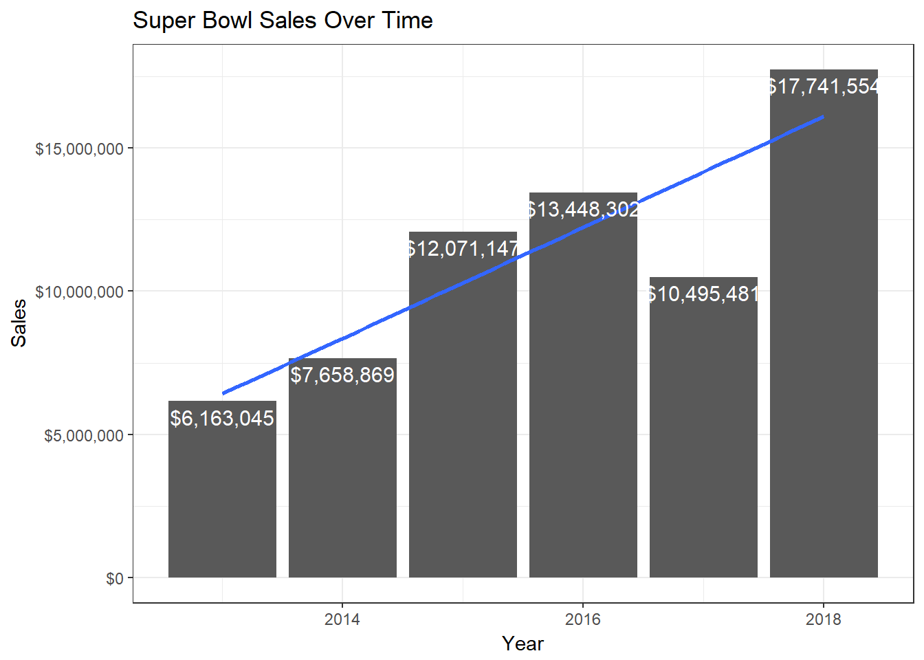 Figure 1.1 Revenue Over Time.
Secondary market Super Bowl sales has a linear growth trend with 2018 being the highest gross sales. Note that these numbers do not take into account inflation but still provide insight into market trends throughout the years.
Next we can examine quantity sold and total sales over the last 3 weeks until the Super Bowl.
SB %>%
  mutate(days_to_event  = as.numeric(days_to_event)) %>%
  group_by(days_to_event, Year) %>%
  summarise(Qty = sum(Qty)) %>%
  filter(days_to_event <= 21) %>%
  ggplot(aes(x = days_to_event, y = Qty, color = Year)) +
  geom_line(aes(y = Qty), color = palette_light()[[1]]) +
  facet_grid(Year ~ ., scales = "free") +
  theme_tq() +
  guides(color = FALSE) +
  labs(title = "Quantity Sold Over Last 3 Weeks",
       x = "",
       y = "Quantity Sold")
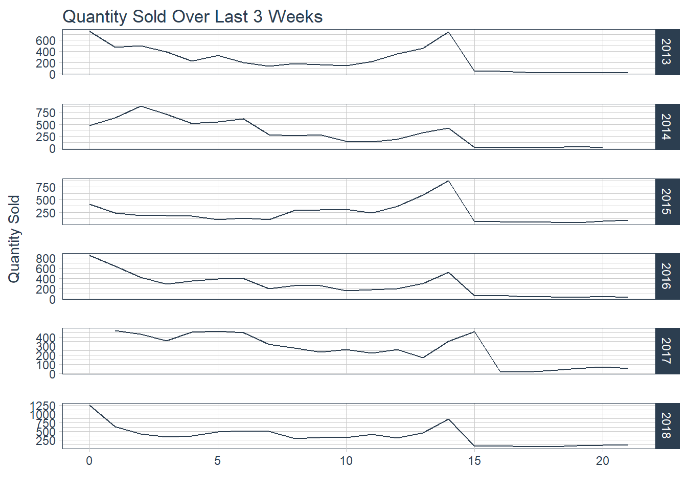 Figure 2.1 Quantity Sold.
SB %>%
  mutate(days_to_event  = as.numeric(days_to_event)) %>%
  group_by(days_to_event, Year) %>%
  summarise(Sale_Price = sum(Sale_Price)) %>%
  filter(days_to_event <= 21) %>%
  ggplot(aes(x = days_to_event, y = Sale_Price, color = Year)) +
  geom_line(aes(y = Sale_Price), color = palette_light()[[1]]) +
  facet_grid(Year ~ ., scales = "free") +
  theme_tq() +
  guides(color = FALSE) +
  labs(title = "Total Sales Over Last 3 Weeks",
       x = "",
       y = "Sale Price")
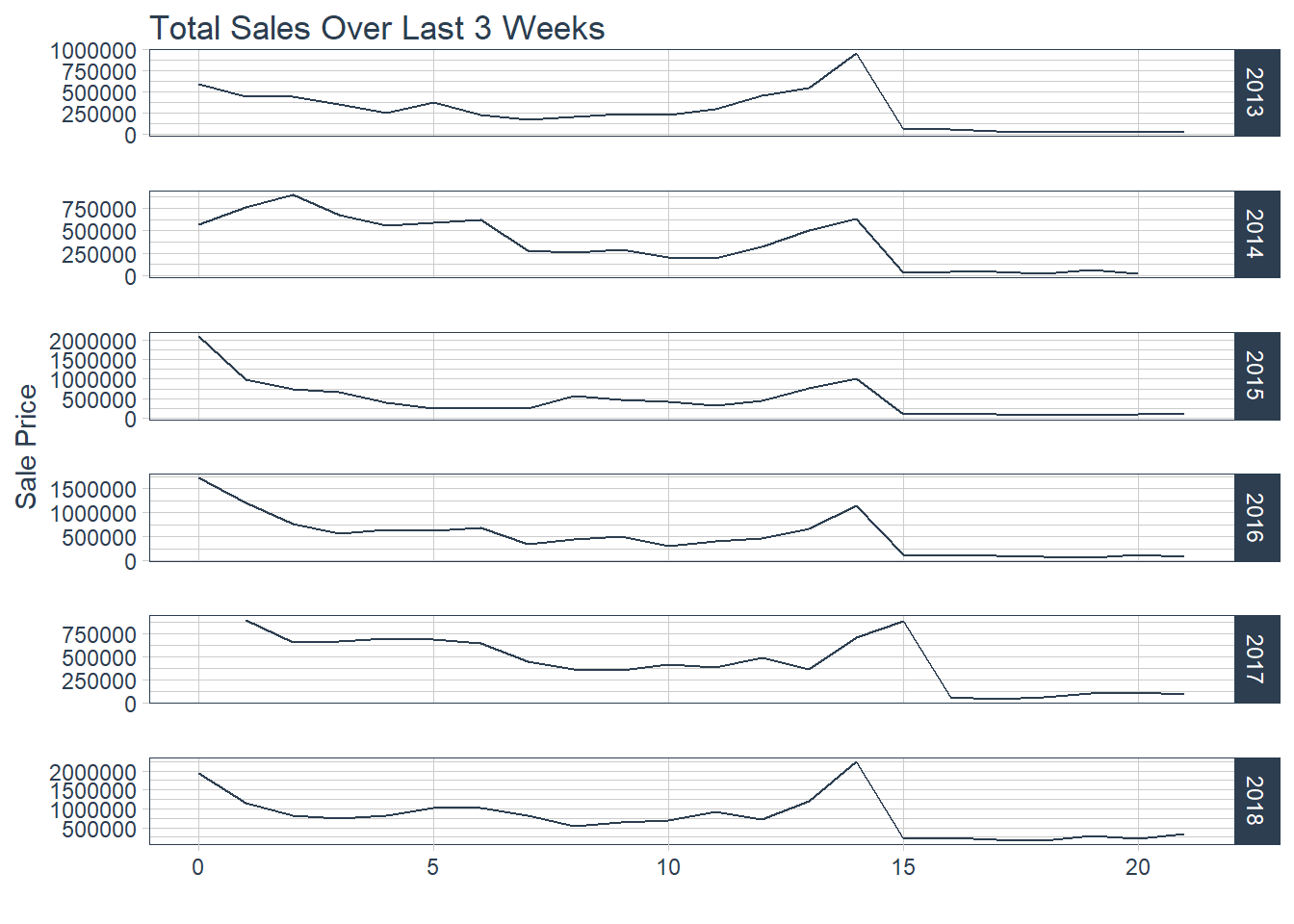 Figure 2.2 Revenue Sold
There is a strong uptick trend at the two weeks out from the game mark for both metrics which intuitively makes sense that has more tickets are sold revenue increases. This is usually when both team are officially decided. Lets further examine a heat map comparing month and day of the month of transactions.
SB %>%
  mutate(day = day(Sale_Date), month = month(Sale_Date)) %>%
  group_by(month, day) %>%
  summarise(total_sales = sum(Sale_Price)) %>%
  ggplot(aes(x = month, y = day, fill = total_sales)) +
    geom_tile(alpha = 0.8, color = "white") +
    scale_fill_gradientn(colours = c(palette_light()[[1]], palette_light()[[2]])) +
    theme_tq() +
    theme(legend.position = "right") +
    labs(title = "Sales per Month and Day",
         y = "Day of the Month",
         fill = "Total Sales")
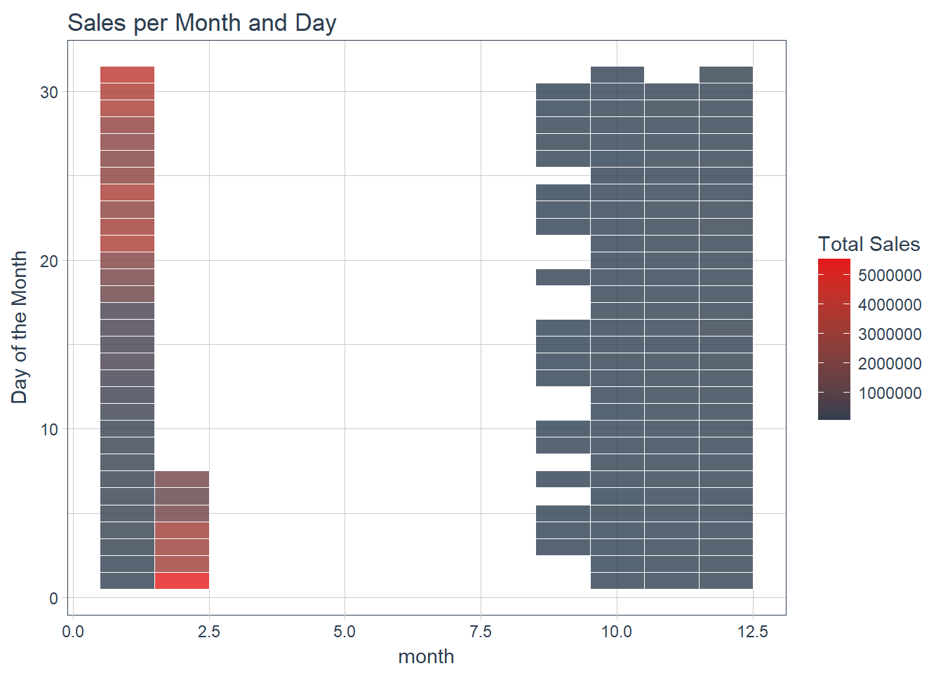 Figure 3 Heat Map of Sales by month and day
The heap map tells us that sales happen less during Oct - Dec and heat up late January and early February closer to the event. There are no sales in March - August. Now we can examine sales by specific sections and zones.
Top 10 Zones
Let’s explore some stadium zones to get an idea of top selling zones.
# Plot top 10 products

# Create top 10 products data frame
zoneSales <- SB %>%
  group_by(Zone = Section) %>%
  summarize(total_sales = sum(Sale_Price),
            qty_total = sum(Qty)) %>%
  mutate(pct_total = total_sales / sum(total_sales)) %>%
  arrange(desc(total_sales))
top10.ordered <- head(zoneSales, 10)
top10.ordered$Zone <- factor(top10.ordered$Zone, levels = arrange(top10.ordered, total_sales)$Zone)

# Use ggplot to plot the top products
ggplot(top10.ordered, aes(Zone, total_sales)) +
  geom_bar(stat="identity") +
  geom_text(aes(ymax=pct_total, label=scales::percent(pct_total)),
      hjust= -0.25,
      vjust= 0.5,
      color="black",
      size=4) +
  geom_text(aes(ymax=qty_total, label=paste("Qty:", qty_total)),
      hjust= 1.25,
      vjust= 0.5,
      color="white",
      size=4) +
  coord_flip() +
  labs(title="Top 10 Zones",
       x="",
       y="Sales")+
  scale_y_continuous(labels = scales::dollar, limits = c(0,2500000)) +
  theme_bw()
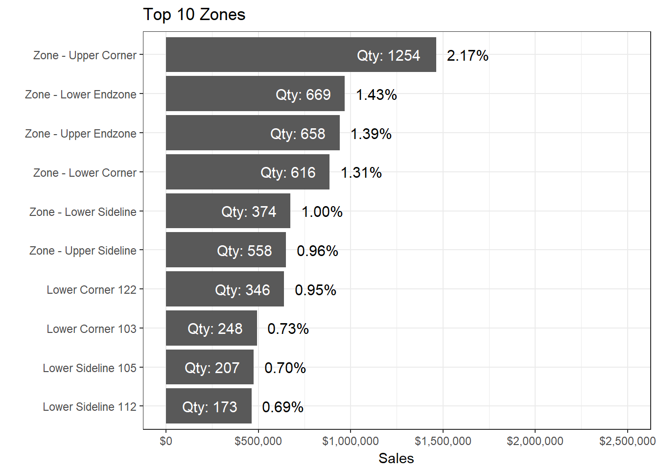 Figure 4 Bar chart for sales by top 5 zones
Unexpectedly Upper Corner is the top selling zone wtih $1,463,821 and 2.17% of total ticket sales. There could be biases in the data due to different stadium layouts. Further analysis would need to group each individual section into specific titled zones.
Geographic Trends
Lets map the sales using leaflet to try and expose sales trends by city.
# Plot sales by geographic location

# Create sales by location from orders extedend, joining latitude and longitude
# data by customer name
salesByLocation <- SB %>%
  group_by(Stadium, LNG, LAT) %>%
  summarise(total_sales = sum(Sale_Price)) %>%
  mutate(popup = paste0(Stadium, ": ", scales::dollar(total_sales)))

# Use Leaflet package to create map visualizing sales by customer location
library(leaflet)
leaflet(salesByLocation) %>%
  addProviderTiles("CartoDB.Positron") %>%
  addMarkers(lng = ~LNG,
             lat = ~LAT,
             popup = ~popup) %>%
  addCircles(lng = ~LNG,
             lat = ~LAT,
             weight = 2,
             radius = ~(total_sales)^0.775)
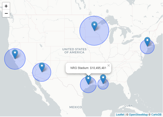 Figure 5 Leaflet Map of past superbowl sales.
Larger circles relate to higher sales, and smaller circles relate to lower sales. leaflet provides interactivety by being able to
click on the markers. The geographic trends are consistent with the sales over time charts.
Now that we have done our exploratory data analysis we can attempt a time series forecast.
Based upon our EDA we have features relevant to forecasting demand or future revenue. We can split the data into a training and test set and begin forecasting future revenue. We will use all data before 2018 Super Bowl as the training data and all data after as the test samples.
SB_forecast <- SB %>%
  group_by(Sale_Date) %>%
  summarise(Qty = sum(Qty), Sales = sum(Sale_Price)) %>%
  mutate(model = ifelse(Sale_Date < "2017-09-10", "train", "test"))

SB_qty <- SB_forecast %>%
  ggplot(aes(Sale_Date, Sales, color = model)) +
  geom_point(alpha = 0.5) +
    geom_line(alpha = 0.5) +
    scale_color_manual(values = palette_light()) +
    theme_tq()

SB_days_until <- SB %>%
  group_by(Sale_Date, days_to_event) %>%
  summarise(Sales = sum(Sale_Price)) %>%
  mutate(model = ifelse(Sale_Date < "2017-09-10", "train", "test")) %>%
  ggplot(aes(days_to_event, Sales, color = model)) +
  geom_point(alpha = 0.5) +
    geom_line(alpha = 0.5) +
    scale_color_manual(values = palette_light()) +
    theme_tq()

grid.arrange(SB_qty, SB_days_until)
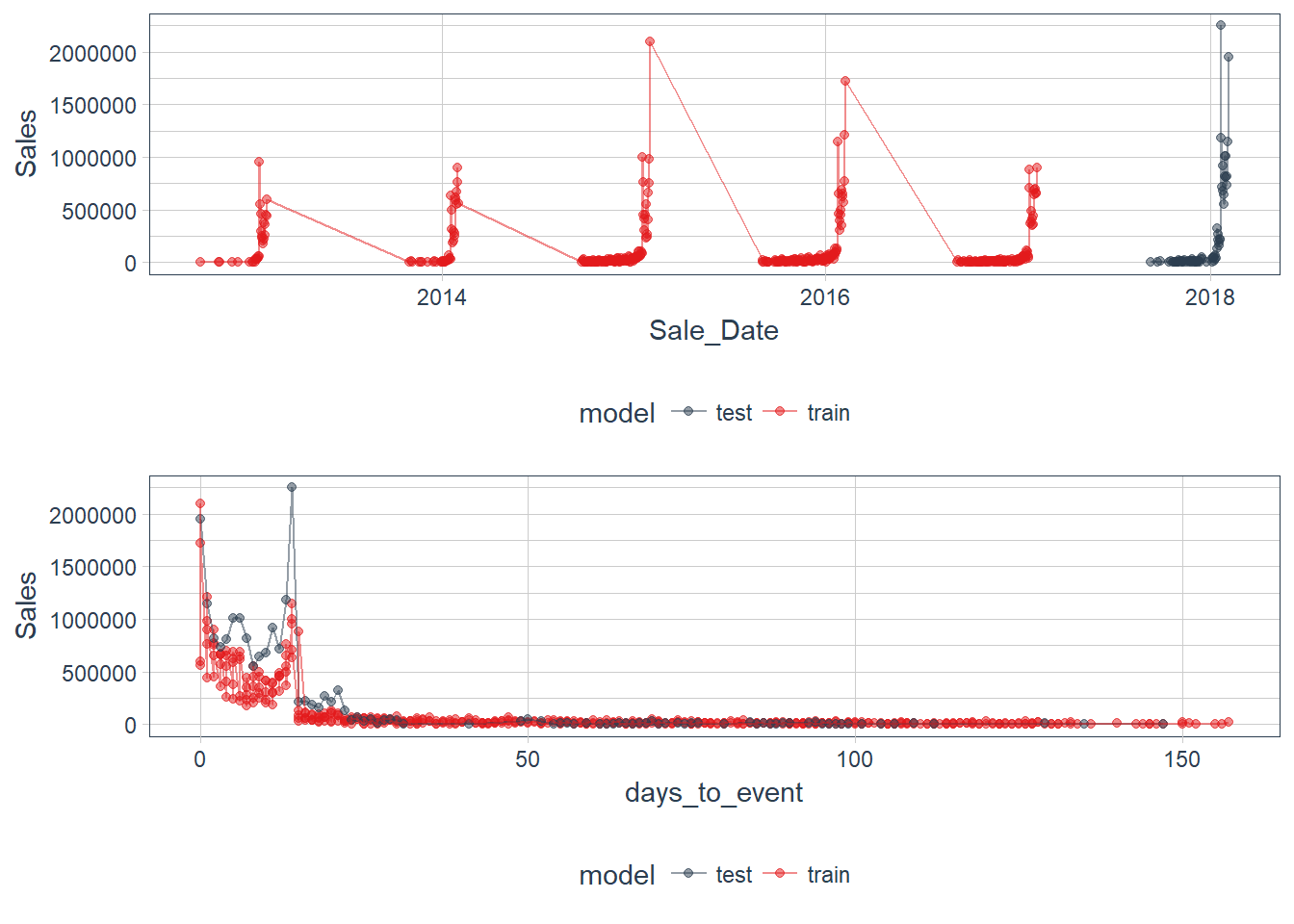 Figure 6 Time Series of Quantity & Sales
Notice the issue with the missing time series values when there are not any sales data. We will have to account for the missing dates when creating our future index.
Using timekt we can add time series signature to our corresponsing repsonse variable.
SB_forecast_aug <- SB_forecast %>%
  select(model, Sale_Date, Sales) %>%
  tk_augment_timeseries_signature()

SB_forecast_aug <- SB_forecast_aug[complete.cases(SB_forecast_aug), ]
After adding the features based on the properties of our tk_augment_timeseries_signature() function we them remove missing values from
the data frame. Since we have to account for the missing sales dates we need to ask ourselves whether replacing those values with the
mean or setting the values to 0. Since there are large gaps in purchases between super bowls for this situation we should set the results
to 0 and also remove values with a variance of 0.
library(matrixStats)

(var <- data.frame(colnames = colnames(SB_forecast_aug[, sapply(SB_forecast_aug, is.numeric)]),
           colvars = colVars(as.matrix(SB_forecast_aug[, sapply(SB_forecast_aug, is.numeric)]))) %>%
  filter(colvars == 0))

SB_forecast_aug <- select(SB_forecast_aug, -one_of(as.character(var$colnames)))
The sales data is aggregated by day so the hour, minute, second, am/pm features are removed. Next we will remove the highly correlated values in the data set.
library(ggcorrplot)

cor <- cor(SB_forecast_aug[, sapply(SB_forecast_aug, is.numeric)])
p.cor <- cor_pmat(SB_forecast_aug[, sapply(SB_forecast_aug, is.numeric)])

ggcorrplot(cor,  type = "upper", outline.col = "white", hc.order = TRUE, p.mat = p.cor,
           colors = c(palette_light()[1], "white", palette_light()[2]))
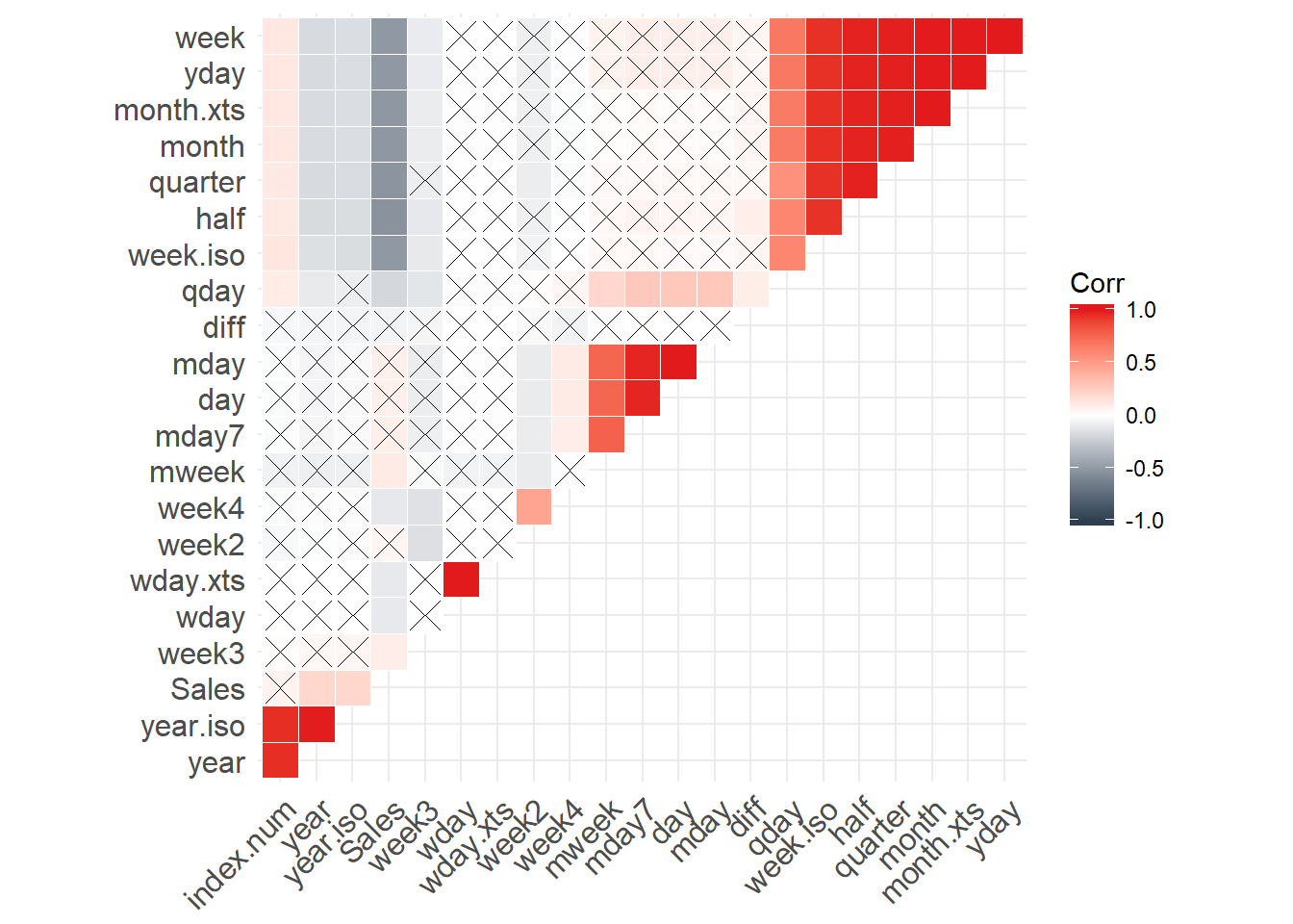 Figure 7 Correlation plot
Examining the correlation plot and data frame I am going to choose to remove features of 0.95 as a cutoff.
cor_cut <- findCorrelation(cor, cutoff = 0.95)
SB_forecast_aug <- select(SB_forecast_aug, -one_of(colnames(cor)[cor_cut]))
After removing the highly correlated values we can split data into our training and test set.
train <- filter(SB_forecast_aug, model == "train") %>%
  select(-model)
test <- filter(SB_forecast_aug, model == "test")
Modeling
The response variable Sales will be modeled using a generalized linear model. We could test numerous statistical learning models to
deviate the best model choice but for this situation Occam probably was right.
fit_lm <- glm(Sales ~ ., data = train)
Visualize the model features using broom and ggplot2
tidy(fit_lm) %>%
  gather(x, y, estimate:p.value) %>%
  ggplot(aes(x = term, y = y, color = x, fill = x)) +
    facet_wrap(~ x, scales = "free", ncol = 4) +
    geom_bar(stat = "identity", alpha = 0.8) +
    scale_color_manual(values = palette_light()) +
    scale_fill_manual(values = palette_light()) +
    theme_tq() +
    theme(axis.text.x = element_text(angle = 45, vjust = 1, hjust = 1))
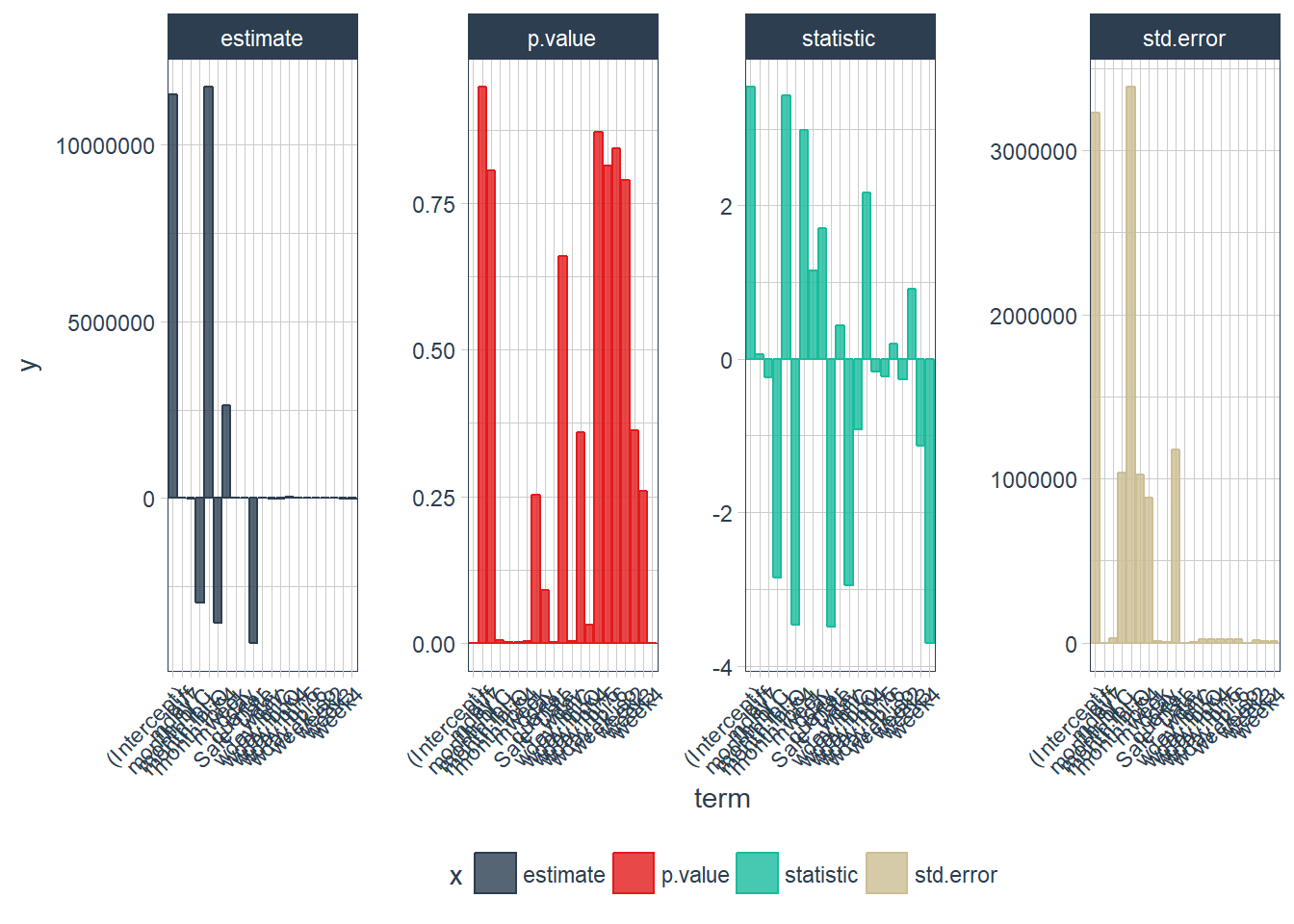 Figure 8 Model features
augment(fit_lm) %>%
  ggplot(aes(x = Sale_Date, y = .resid)) +
    geom_hline(yintercept = 0, color = "red") +
    geom_point(alpha = 0.5, color = palette_light()[[1]]) +
    geom_smooth() +
    theme_tq()
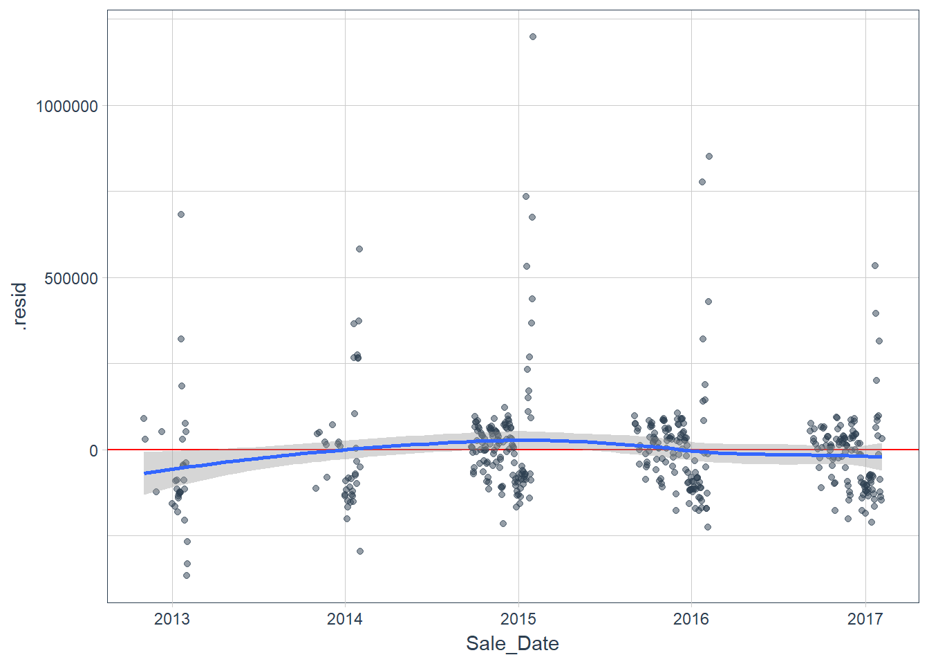 Figure 9
After plotting we can now add predictions and residuals for the test data and visualize the residuals.
pred_test <- test %>%
  add_predictions(fit_lm, "pred_lm") %>%
  add_residuals(fit_lm, "resid_lm")

pred_test %>%
    ggplot(aes(x = Sale_Date, y = resid_lm)) +
    geom_hline(yintercept = 0, color = "red") +
    geom_point(alpha = 0.5, color = palette_light()[[1]]) +
    geom_smooth() +
    theme_tq()
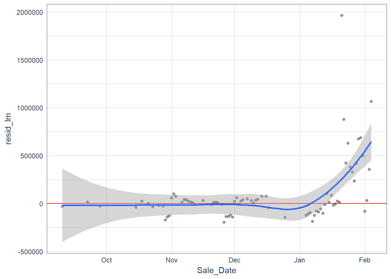 Figure 10
After examining the residuals we would probably want to do some form of model transformation on the response variable using interaction or adding polynomial terms to the independent variables but we can leave that explanation for another time.
Now we compare the predicted against the actual data in the test set.
pred_test %>%
  gather(x, y, Sales, pred_lm) %>%
  ggplot(aes(x = Sale_Date, y = y, color = x)) +
    geom_point(alpha = 0.5) +
    geom_line(alpha = 0.5) +
    scale_color_manual(values = palette_light()) +
    theme_tq()
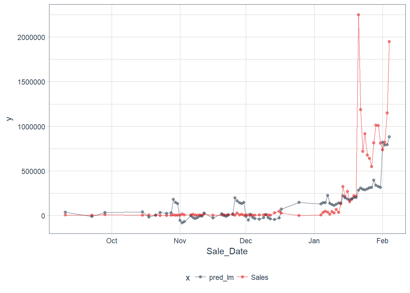 Figure 11
Our model apears to miss the uptick in sales in late January but appears consistent none the less.
Forecasting
Now that our feature selection is out of the way we can forecast next years total Super Bowl tickets sales. First we extract and index
using the tk_index function.
# Extract index
idx <- SB_forecast %>%
    tk_index()

idx_future <- idx %>%
  tk_get_timeseries_summary()
idx_future
    ## # A tibble: 1 x 12
    ##   n.obs start      end        units scale tzone diff.minimum diff.q1
    ##   <int> <date>     <date>     <chr> <chr> <chr>        <dbl>   <dbl>
    ## 1   524 2012-09-30 2018-02-04 days  day   UTC          86400   86400
    ## # ... with 4 more variables: diff.median <dbl>, diff.mean <dbl>,
    ## #   diff.q3 <dbl>, diff.maximum <dbl>
We need to account for the irregular data because we are missing dates due to no past sales and the mean difference does not equal 86400 or 1 day.
We need to beware of that we never have data for days where there are no sales and we have a few random missing values in between, as can be seen in the diff column of SB_forecast_aug (1 day difference is 86400 seconds).
SB_forecast_aug %>%
  ggplot(aes(x = Sale_Date, y = diff)) +
    geom_point(alpha = 0.5, aes(color = as.factor(diff))) +
    geom_line(alpha = 0.5) +
    theme_tq()
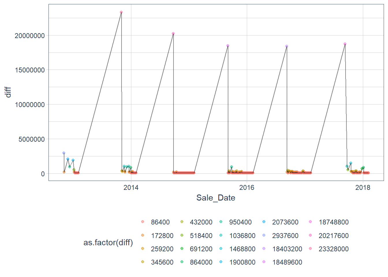 Figure 12
Create future index and rename index to Sale_Date to match original data. We account for the missing days on a monthly, quarterly, or
yearly schedule using the inspect_months function.
idx_future <- idx %>%
  tk_make_future_timeseries(n_future = 365, inspect_months = TRUE)

data_future <- idx_future %>%
    tk_get_timeseries_signature() %>%
    rename(Sale_Date = index)
Predict the future values and build the future data frame.
pred_future <- predict(fit_lm, newdata = data_future)
sales_future <- data_future %>%
select(Sale_Date) %>%
add_column(Sales = pred_future)
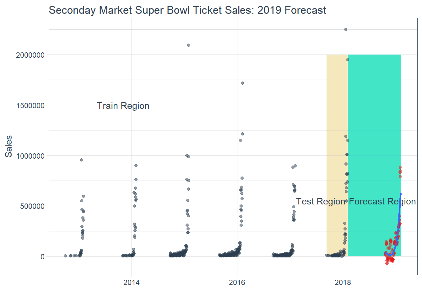
SB_forecast %>%
ggplot(aes(x = Sale_Date, y = Sales)) +
geom_rect(xmin = as.numeric(ymd("2017-09-10")),
xmax = as.numeric(ymd("2018-02-04")),
ymin = 0, ymax = 2000000,
fill = palette_light()[[4]], alpha = 0.01) +
geom_rect(xmin = as.numeric(ymd("2018-02-05")),
xmax = as.numeric(ymd("2019-02-04")),
ymin = 0, ymax = 2000000,
fill = palette_light()[[3]], alpha = 0.01) +
annotate("text", x = ymd("2013-11-03"), y = 1500000,
color = palette_light()[[1]], label = "Train Region") +
annotate("text", x = ymd("2017-08-01"), y = 550000,
color = palette_light()[[1]], label = "Test Region") +
annotate("text", x = ymd("2018-10-01"), y = 550000,
color = palette_light()[[1]], label = "Forecast Region") +
geom_point(alpha = 0.5, color = palette_light()[[1]]) +
geom_point(aes(x = Sale_Date, y = Sales), data = sales_future,
alpha = 0.5, color = palette_light()[[2]]) +
geom_smooth(aes(x = Sale_Date, y = Sales), data = sales_future,
method = 'loess') +
labs(title = "Seconday Market Super Bowl Ticket Sales: 2019 Forecast", x = "") +
theme_tq()
```
[](http://allanbutler.github.io/img/forecast_12.png)
Figure 13
Notice the negative values. This is not only impossible but might tell us something about the error rate in our model. We can visualize
this by plotting the standard deviation of the test residuals.
```r
test_residuals <- pred_test$resid_lm
test_resid_sd <- sd(test_residuals, na.rm = TRUE)
sales_future <- sales_future %>%
mutate(
lo.95 = Sales - 1.96 * test_resid_sd,
lo.80 = Sales - 1.28 * test_resid_sd,
hi.80 = Sales + 1.28 * test_resid_sd,
hi.95 = Sales + 1.96 * test_resid_sd
)
SB_forecast %>%
ggplot(aes(x = Sale_Date, y = Sales)) +
geom_point(alpha = 0.5, color = palette_light()[[1]]) +
geom_ribbon(aes(ymin = lo.95, ymax = hi.95), data = sales_future,
fill = "#D5DBFF", color = NA, size = 0) +
geom_ribbon(aes(ymin = lo.80, ymax = hi.80, fill = key), data = sales_future,
fill = "#596DD5", color = NA, size = 0, alpha = 0.8) +
geom_point(aes(x = Sale_Date, y = Sales), data = sales_future,
alpha = 0.5, color = palette_light()[[2]]) +
geom_smooth(aes(x = Sale_Date, y = Sales), data = sales_future,
method = 'loess', color = "white") +
labs(title = "Seconday Market Super Bowl Ticket Sales: 2019 Forecast with Prediction Intervals", x = "") +
theme_tq()
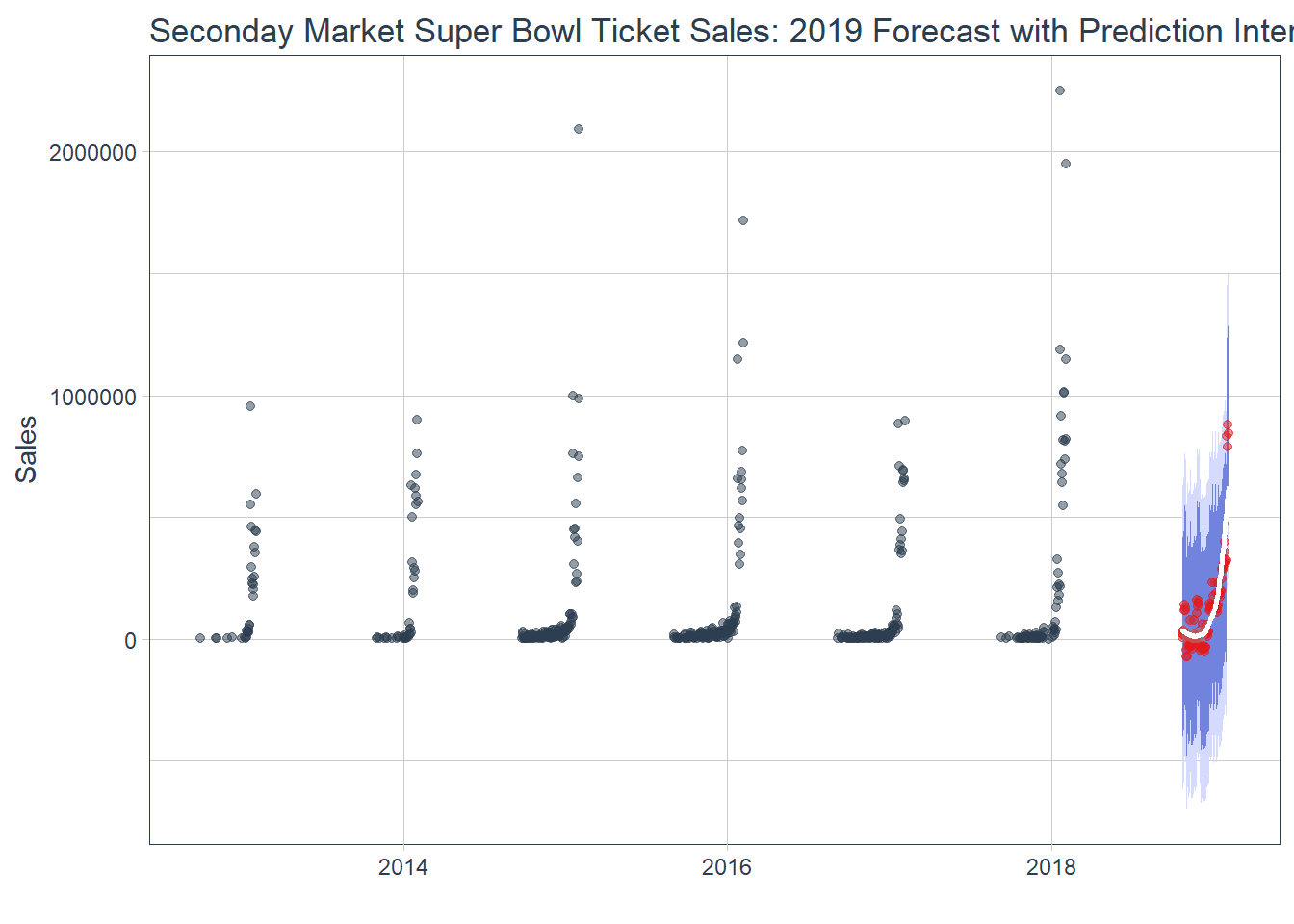 Figure 14
Our model predicts that 2019 Super Bowl Sales will not be as prosperous as 2018. The secondary ticket market is notable for high variance and can have a highly uncertain future. Although the revenue forecast follows a similar curve compared to past years summarising a total will provide a better view.
combine1 <- SB %>%
  select(Year, Sale_Price) %>%
  group_by(Year) %>%
  summarise(total_sales = sum(Sale_Price))

combine2 <- sales_future %>%
  mutate(Year = 2019) %>%
  na.omit() %>%
  group_by(Year) %>%
  summarise(total_sales = sum(Sales))
All <- bind_rows(combine1, combine2)

ggplot(All, aes(Year, total_sales)) +
  geom_bar(stat = "identity") +
  geom_smooth(method = "lm", se = FALSE) +
  labs(title="Super Bowl Sales Over Time", x="Year", y="Sales") +
  scale_y_continuous(labels = scales::dollar) +
  geom_text(aes(y=total_sales, label=scales::dollar(total_sales)),
                        vjust=1.5,
                        color="white",
                        size=3.5) +
  theme_tq()
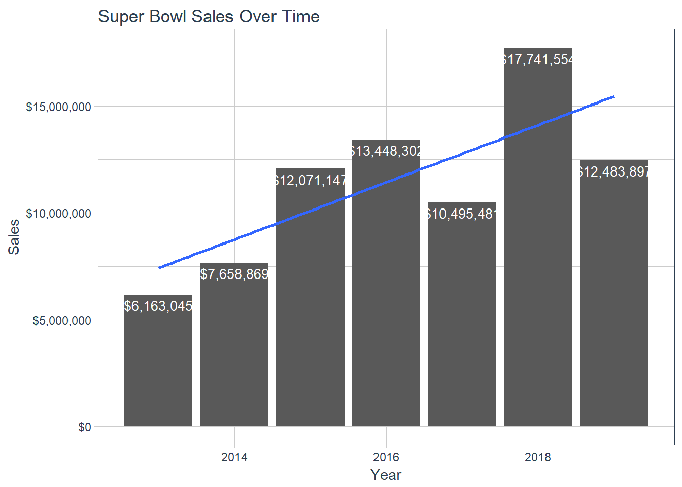 Figure 15 Total Revenue Including Forecast
A little data manipulation helps us plot the total forecasted revenue alongside the previoius years for a clear comparison snapshot and
visualizing the linear trend. The upward linear trend in sales is a testimate to the growing secondary market along with Super Bowl
prices outpacing inflation growth. A further interesting analysis would be comparing wage growth and overall inflation rates amongst
Super Bowl prices. Forecasting using the timekt approach is a great machine learning application based upon our data set. However, a
prediction is only as good as the data used and a major omitted variable in our analysis is the teams playing and the location. These
features can be added to the regression but our example tried to simplify as much as possible to get the results for an outcome. In a
real business case example different features could be tested to achieve the most optimal model and result.