A Data Driven Approach to Housebreaking My Puppy
 Figure 1.1 Don’t let the cuteness fool you.
Housetraining a puppy is work. Don’t let the cuteness of your pup fool you into thinking housetraining will be a breeze, although the right training up front will save you agony down the road. After reading Rover’s post on house breaking your dog I decided to take a data approach to housetraining by documenting eating and bathroom breaks. After a month of recording data I was not only extremely grateful for automation of data warehouses but also able to determine if my pup was on the right track with her potty and eating behaviors. For this post I will only use her bathroom dataset.
First we will load the data into a data frame for exploratory analysis along with the correct R packages. Exploratory analysis is about asking a series of data questions and trying to gain useful insights to influence our decision making.
library(tidyverse)
library(lubridate)
library(ggthemes)
library(modelr)
library(broom)
library(caret)
library(tidytext)
library(lime)
library(ggridges)
library(viridis)

potty_records <- read_csv("Aimee/potty_records.csv") %>%
  mutate(Date = mdy(Date), day_of_week = wday(Date, label = TRUE))
potty_records$hour <- as.POSIXlt(potty_records$Time, format="%H:%M")$hour
Visual Exploration
Now that we have the data loaded with the appropriate packages we can start the EDA process by drawing some plots. Lets start with some plots to get to know the data and visualize whether there are any trends that would help understand the relationship between Potty break or in-house accident? variable and other variables. But first we need to clarify where the missing values exist and if it will cause a problem with the EDA phase.
# List of NAs
potty_records %>%
  purrr::map_df(~sum(is.na(.)))
## # A tibble: 1 x 10
##   `Trial No.`  Date  Time `Potty break or in-ho~ `U(rination), D(efecatio~
##         <int> <int> <int>                  <int>                     <int>
## 1           0     0     0                      2                         0
## # ... with 5 more variables: `What was the dog doing pre-elimination?
## #   (nap, meal, walk, play, sniffing, pacing, etc.)` <int>, `Consequences
## #   for the dog (play, treat, walk, scolding, clean up/no response?)`
## #   <int>, Notes <int>, day_of_week <int>, hour <int>
We see that there are 359 NA values in the Notes, 2 in the Potty break, and 2 in the Pre-elimination column. Since this is manually logged I know that the Pre-elimination NAs were because of only finding the accident and not seeing any behaviors beforehand or from taking the dog out and no action occurred. It is important to know your data and troubleshoot any data integrity issues that you find.
Lets now visualize by column Potty break or in-house accident? over time to get a trend. We can plot the Success average over time to gain a better visualization of the Success rate and see if results have been constantly happening or they just started happening all of a sudden.
potty_records %>%
  rename(type = `Potty break or in-house accident?`) %>%
  group_by(Date, type) %>%
  summarise(n = n()) %>%
  mutate(freq = n/sum(n)) %>%
  ggplot(aes(Date, freq, color = type)) +
  geom_point(size = 1) +
  geom_smooth(method = "lm") +
  scale_color_fivethirtyeight("type") +
  labs(title = "Time Series of Bathroom Type",
          subtitle = "by % of Success or Accident") +
  theme_fivethirtyeight()
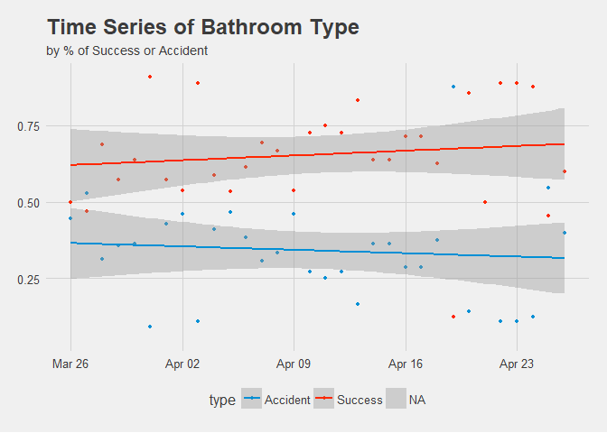
Figure 1.2 Time Series of Success or Accident by Percent.
Great, it appears Success has a linear trend upward over time despite some minor setbacks. She appears to be a quick learner and Accidents have definitely decreased.
The first granular look we can do is look at bathroom trips across the different days of the week by hour.
potty_records %>%
  ggplot(aes(x = hour, y = day_of_week, fill = ..x..)) +
  geom_density_ridges_gradient(scale = 3) +
  scale_x_continuous(expand = c(0.01, 0)) +
  scale_y_discrete(expand = c(0.01, 0)) +
  scale_fill_viridis(name = "Hour", option = "C") +
  labs(title = "Number of Potty Breaks By Day of the Week & Hour",
       subtitle = "Source: Aimee's housebreaking",
       x = "Hour") +
  theme_ridges(font_size = 13, grid = TRUE) + theme(axis.title.y = element_blank())
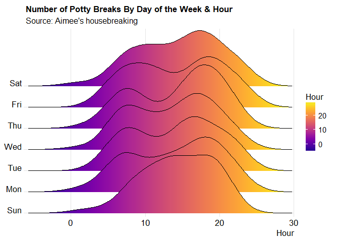 Figure 1.2 Joy Plot of Potty Breaks by Day & Hour.
Here we can see that Aimee definitely goes to the bathroom more often later in the day. I would assume this is because I am home from work and she is out more. Also, the variance in Thursday is also a little unusual.
Next thing to do is examine further into hours and types of Accidents vs Success and search for patterns.
success <- potty_records %>%
  filter(`Potty break or in-house accident?` == 'Success')

success_hour <- ggplot(aes(x = hour), data = success) + geom_histogram(bins = 24, color = 'black', fill = 'blue') +
  ggtitle('Histogram of Success Potty Times by Type') +
  facet_wrap(~ `U(rination), D(efecation), N(either), B(oth)`) +
  theme_minimal()

accident <- potty_records %>%
  filter(`Potty break or in-house accident?` == 'Accident')

accident_hour <- ggplot(aes(x = hour), data = accident) + geom_histogram(bins = 24, color = 'black', fill = '#CE1141') +
  ggtitle('Histogram of Accident Times by Type') +
  facet_wrap(~ `U(rination), D(efecation), N(either), B(oth)`) +
  theme_minimal()

accident_hour
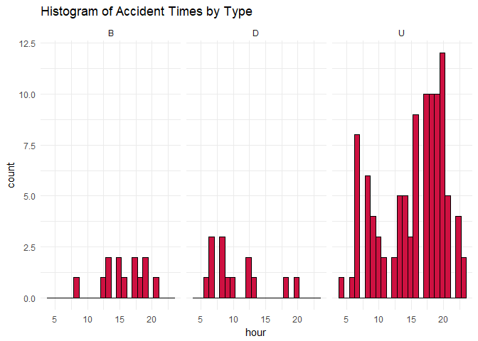 Figure 1.3 Histogram of Accident Times by Type.
success_hour
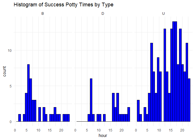 Figure 1.4 Histogram of Success Times by Type.
Again, the afternoon seems to be her most active restroom activity as well as when the most accidents occur. This is probably due to Aimee being out of her crate and having more free range.
Lets also examine actions before potty times and compare successful and in house accidents.
a <- potty_records %>%
  filter(`Potty break or in-house accident?` == 'Success') %>%
  group_by(`What was the dog doing pre-elimination? (nap, meal, walk, play, sniffing, pacing, etc.)`) %>%
  summarise(n = n()) %>%
  mutate(freq = n/sum(n))

action_success <- ggplot(aes(x = `What was the dog doing pre-elimination? (nap, meal, walk, play, sniffing, pacing, etc.)`, y = freq), data = a) +
  geom_bar(stat = "identity", fill = "blue") +
   geom_text(aes(label = paste0(round(freq*100, 0), "%")), position = position_stack(vjust = 0.5), size = 3.5) +
  theme_fivethirtyeight() +
      labs(x = "",
       y = "Fequency",
       title = 'Action Before Successful Potty Times')

b <- potty_records %>%
  filter(`Potty break or in-house accident?` == 'Accident') %>%
  group_by(`What was the dog doing pre-elimination? (nap, meal, walk, play, sniffing, pacing, etc.)`) %>%
  summarise(n = n()) %>%
  mutate(freq = n/sum(n))

action_accident <- ggplot(aes(x = `What was the dog doing pre-elimination? (nap, meal, walk, play, sniffing, pacing, etc.)`, y = freq), data = b) +
  geom_bar(stat = "identity", fill = "#E31837") +
   geom_text(aes(label = paste0(round(freq*100, 0), "%")), position = position_stack(vjust = 0.5), size = 3.5) +
  theme_fivethirtyeight() +
      labs(x = "",
       y = "Fequency",
       title = 'Action Before Accident Potty Times')

action_success
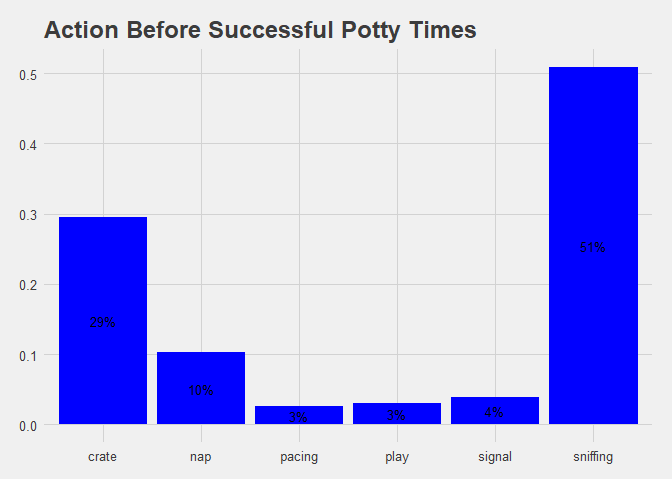 Figure 1.5 Bar Chart of Success by Before Action.
action_accident
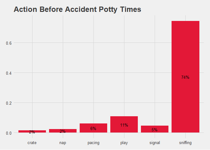 Figure 1.5 Bar Chart of Accident by Before Action.
Examing the action before accident bar chart shows a clear trend of sniffing before the accident happens. This is a common and intuitive tell from any dog that they are searching for relief spot but it is nice to have the data to support the claim.
Lastly let plot the consequences for Success and Accident by Consequences for the dog (play, treat, walk, scolding, clean up/no response?)
c <- potty_records %>%
  filter(`Potty break or in-house accident?` == 'Success') %>%
  group_by(`Consequences for the dog (play, treat, walk, scolding, clean up/no response?)`) %>%
  summarise(n = n()) %>%
  mutate(freq = n/sum(n))

ggplot(aes(x = `Consequences for the dog (play, treat, walk, scolding, clean up/no response?)`, y = freq), data = c) +
  geom_bar(stat = "identity", fill = "blue") +
   geom_text(aes(label = paste0(round(freq*100, 0), "%")), position = position_stack(vjust = 0.5), size = 3.5) +
  theme_fivethirtyeight() +
      labs(x = "",
       y = "Fequency",
       title = 'Consequences after Successful Relief')
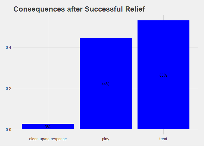 Figure 1.6 Bar Chart of Success by Consequence.
d <- potty_records %>%
  filter(`Potty break or in-house accident?` == 'Accident') %>%
  group_by(`Consequences for the dog (play, treat, walk, scolding, clean up/no response?)`) %>%
  summarise(n = n()) %>%
  mutate(freq = n/sum(n))

ggplot(aes(x = `Consequences for the dog (play, treat, walk, scolding, clean up/no response?)`, y = freq), data = d) +
  geom_bar(stat = "identity", fill = "#E31837") +
   geom_text(aes(label = paste0(round(freq*100, 0), "%")), position = position_stack(vjust = 0.5), size = 3.5) +
  theme_fivethirtyeight() +
      labs(x = "",
       y = "Fequency",
       title = 'Consequences for Accident in House')
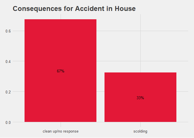 Figure 1.6 Bar Chart of Accident by Consequence.
When training Aimee we are going by Karen Pryor’s positive reinforcement method and it definitely appears in the data but 33% my partner and I could not hold back the scolding. After all, we are only human.
Formulate hypothesis around EDA
The available data is limited to the bathroom data. Using the potty_records we know whether she has a Success or an Accident. Based upon the data my hypothesis’ are:
-
Based upon what she was doing pre-elimination we can try to determine whether or not we will have a
Successor anAccident. This may or may not be enough to build a sufficient prediction model but we can gain some insights from building a machine learning model for variable importance. A better question may be “What might make theAccidentcolumn tally less and more?” For instance, is there any difference between action before pre-elimination or between consequences. Or, if time of meals has anything to do with whether the pup will have aSuccessorAccident. -
Consequences for the dog seem to be making a big difference for
Successrate improving. -
Based upon hour and type of potty there doesn’t seem to be a difference between whether an elimination will be
SuccessorAccident.
Now lets evaluate these hypotheses by building some models and a few more plots.
potty_records %>%
  group_by(Date, `Potty break or in-house accident?`) %>%
  summarise(n = n()) %>%
  na.omit() %>%
  ggplot(aes(`Potty break or in-house accident?`, n)) +
  geom_boxplot(color = "black", aes(fill = factor(`Potty break or in-house accident?`))) +
  theme_bw() +
  scale_fill_brewer(palette = "Blues") +
  labs(title = "Potty break or in-house accident?",
       x = "",
       y = "") +
  guides(fill = guide_legend(title = "Type"))
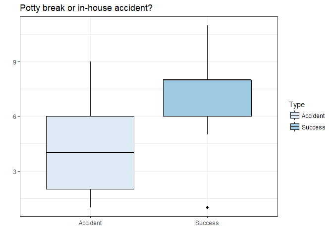 Figure 1.7 Box Plot.
Examining the box plot we see that Accident by day appears to have a wider variance while Success occurs more often but has one outlier. Since this is group_by day I can remember the unsuccessful day of housebreaking. Lets dig deeper and build some models.
Correlation is different from causation.
Through building a classification model we can understand the relationship between the variables better. We can also understand and perhaps explain changes in Success and Accident. But the relationship is correlation, meaning that changes in Success rate are influenced by certain metrics and not caused by them.
Model Building
Since our predictor is a binary outcome we will use a machine learning model to predict Success or Accident. I will also use some plotting and variable importance to get insights about how to extract information from the variables using the caret and lime packages.
Lets build and evaluate a model to help us determine important variables for Success and/or Accident by removing time stamps and dates from the data. We will also remove the Trial No and day_of_week because they are not driving whether or not Aimee will have a Success or not and we do not want to overfit the model.
potty_records_model <- potty_records %>%
  select(-Notes, -`Time`, -Date, -`Trial No.`, -day_of_week) %>%
  mutate(`Potty break or in-house accident?` = as.factor(`Potty break or in-house accident?`),
         `U(rination), D(efecation), N(either), B(oth)` = as.factor(`U(rination), D(efecation), N(either), B(oth)`),
         `What was the dog doing pre-elimination? (nap, meal, walk, play, sniffing, pacing, etc.)` = as.factor(`What was the dog doing pre-elimination? (nap, meal, walk, play, sniffing, pacing, etc.)`), `Consequences for the dog (play, treat, walk, scolding, clean up/no response?)` = as.factor(`Consequences for the dog (play, treat, walk, scolding, clean up/no response?)`)) %>%
  na.omit()

potty_records_model <- potty_records_model %>%
  rename(type = `U(rination), D(efecation), N(either), B(oth)`, action_before = `What was the dog doing pre-elimination? (nap, meal, walk, play, sniffing, pacing, etc.)`, Consequences = `Consequences for the dog (play, treat, walk, scolding, clean up/no response?)`)

# Replace NAs w/ 0s
potty_records_model <- potty_records_model %>%
  mutate_if(is.numeric, funs(replace(., is.na(.), 0)))
Now we split the data into training and test set. In this situation, we are looking at Success potty trips. Now we can fit some models using a random forest.
# training and test set
set.seed(42)
index <- createDataPartition(potty_records_model$`Potty break or in-house accident?`, p = 0.6, list = FALSE)
train_data <- potty_records_model[index, ]
test_data  <- potty_records_model[-index, ]

# modeling
model_rf <- caret::train(`Potty break or in-house accident?` ~ .,
  data = train_data,
  method = "rf", # random forest
  trControl = trainControl(method = "repeatedcv",
       number = 10,
       repeats = 5,
       verboseIter = FALSE))

model_rf
## Random Forest
##
## 219 samples
##   4 predictor
##   2 classes: 'Accident', 'Success'
##
## No pre-processing
## Resampling: Cross-Validated (10 fold, repeated 5 times)
## Summary of sample sizes: 197, 197, 197, 198, 197, 197, ...
## Resampling results across tuning parameters:
##
##   mtry  Accuracy   Kappa
##    2    0.9663919  0.9235532
##    7    0.9826802  0.9631164
##   12    0.9782138  0.9531246
##
## Accuracy was used to select the optimal model using the largest value.
## The final value used for the model was mtry = 7.
Our accuracy of the model is 98.27%. Our goal is not to perfect a prediction of whether she will have an accident or a successful bathroom trip but it is good to know our dependent variable is measured effectively by the independent variables in our dataset. Since we have a good prediction accuracy we can now extract insights.
pred <- data.frame(sample_id = 1:nrow(test_data), predict(model_rf, test_data, type = "prob"), actual = test_data$`Potty break or in-house accident?`) %>%
  mutate(prediction = colnames(.)[2:3][apply(.[, 2:3], 1, which.max)], correct = ifelse(actual == prediction, "correct", "wrong"))

confusionMatrix(pred$actual, pred$prediction, positive = "Success")
## Confusion Matrix and Statistics
##
##           Reference
## Prediction Accident Success
##   Accident       51       0
##   Success         2      91
##
##                Accuracy : 0.9861
##                  95% CI : (0.9507, 0.9983)
##     No Information Rate : 0.6319
##     P-Value [Acc > NIR] : <2e-16
##
##                   Kappa : 0.9699
##  Mcnemar's Test P-Value : 0.4795
##
##             Sensitivity : 1.0000
##             Specificity : 0.9623
##          Pos Pred Value : 0.9785
##          Neg Pred Value : 1.0000
##              Prevalence : 0.6319
##          Detection Rate : 0.6319
##    Detection Prevalence : 0.6458
##       Balanced Accuracy : 0.9811
##
##        'Positive' Class : Success
##
LIME needs data without response variable
train_x <- dplyr::select(train_data, -`Potty break or in-house accident?`)
test_x <- dplyr::select(test_data, -`Potty break or in-house accident?`)

train_y <- dplyr::select(train_data, `Potty break or in-house accident?`)
test_y <- dplyr::select(test_data, `Potty break or in-house accident?`)
Build explainer, the key function in lime that explains the model’s predictions.
explainer <- lime(train_x, model_rf, n_bins = 5, quantile_bins = TRUE)
Run explain() function. We are setting the n_featuers = 8. This helps breakdown the complexity of trying to understand all the features in the dataset, which can lead to more confusion. Next we set the feature_select function to “forward_selection”, which is the auto default in the lime package.
explanation_df <- lime::explain(test_x, explainer, n_labels = 2, n_features = 8, n_permutations = 1000, feature_select = "forward_selection")
The feature importance plot is the reason LIME is so useful. This allows us to visualize each of the first 3 cases (observations) from the test data. The top four features for each case are shown. Note that they are not the same for each case. The green bars mean that the feature supports the model conclusion, and the red bars contradict.
plot_features(explanation_df[1:24, ], ncol = 2) +
  labs(title = "LIME Feature Importance Visualization")
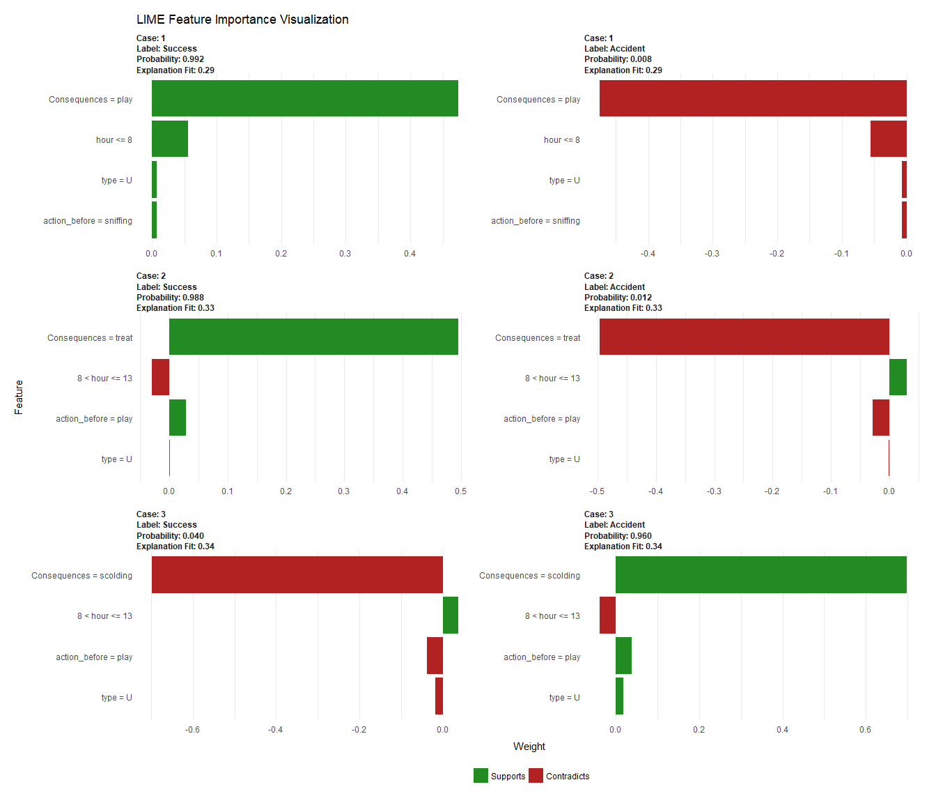 Figure 1.9 Lime Feature Importantance.
Lime is able to provide with an easy to view plot but what does the data tell us? Lets examine case 1:
pred %>%
  filter(sample_id == 1)
##   sample_id Accident Success  actual prediction correct
## 1         1    0.008   0.992 Success    Success correct
Case 1 was correctly predicted to come from the Success group because it
- Has play as a consequence for action after potty break
- The hour the action occurred was <= 8
- The action before was sniffing
- The type was labeled U
The explanatory plot tells us for each feature the range of values the data point would fall. If it does, this gets counted as support for this prediction, if it does not, it gets scored as contradictory. For instance, examining case 3 on the plot, scolding contradicts the support for a Success.
plot_explanations() is another great visualization that can be utilized with LIME. The function produces a faceted heatmap of all feature combinations.
df <- explanation_df %>%
  mutate(case = as.numeric(case)) %>%
  filter(case < 31)

plot_explanations(df) +
  labs(title = "LIME Feature Importance Heatmap",
   subtitle = "Hold Out (Test) Set, First 30 Cases Shown")
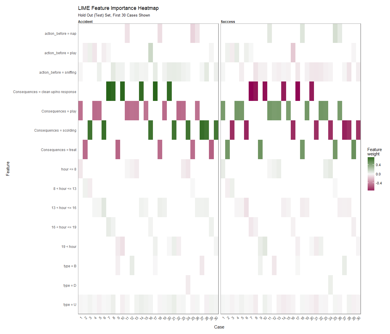 Figure 1.10 Lime Feature Importantance Heatmap.
Power Test and Difference in Means
Since we do not have a randomized control experiment we will control for type and see where we are achieving Success in the house breaking. First examine overall Success rate.
test <- potty_records %>%
  mutate(Success = case_when(`Potty break or in-house accident?` == 'Success' ~ 1,
                             `Potty break or in-house accident?` == 'Accident' ~ 0))

test_mean <- test %>%
  summarise(n = n(),
            mean_success = mean(Success, na.rm = TRUE),
            std_error = sd(Success, na.rm = TRUE) / sqrt(n),
            sd = sd(Success, na.rm = TRUE),
            lower.ci = mean_success - qt(1 - (0.05/2), n - 1) * std_error,
            upper.ci = mean_success + qt(1 - (0.05/2), n - 1) * std_error)
test_mean
## # A tibble: 1 x 6
##       n mean_success std_error    sd lower.ci upper.ci
##   <int>        <dbl>     <dbl> <dbl>    <dbl>    <dbl>
## 1   365        0.645    0.0251 0.479    0.595    0.694
We have an overall Success rate of 64%. Lets now examine where we are achieving the most Success.
We can control for U(rination), D(efecation), N(either), B(oth) to see if results would be causal.
test_type <- test %>%
  group_by(`U(rination), D(efecation), N(either), B(oth)`) %>%
  summarise(n = n(),
            mean_success = mean(Success, na.rm = TRUE),
            std_error = sd(Success, na.rm = TRUE) / sqrt(n),
            sd = sd(Success, na.rm = TRUE),
            lower.ci = mean_success - qt(1 - (0.05/2), n - 1) * std_error,
            upper.ci = mean_success + qt(1 - (0.05/2), n - 1) * std_error) %>%
  filter(n > 2) %>%
  arrange(desc(mean_success))
test_type
## # A tibble: 3 x 7
##   `U(rination), D(ef~     n mean_success std_error    sd lower.ci upper.ci
##   <chr>               <int>        <dbl>     <dbl> <dbl>    <dbl>    <dbl>
## 1 B                      53        0.755    0.0597 0.434    0.635    0.874
## 2 D                      41        0.659    0.0750 0.480    0.507    0.810
## 3 U                     269        0.621    0.0296 0.486    0.562    0.679
Even though it can feel like I have been achieving progress, the least amount of progress is with U. This could be because of the amount of times she goes U and if a larger accident is taking place Aimee is immediately taken outside.
Lets now visualize the statistics.
test_type %>%
  rename(Type = `U(rination), D(efecation), N(either), B(oth)`) %>%
ggplot(aes(mean_success, n, color = Type)) +
    geom_point() +
    geom_errorbarh(aes(xmin = lower.ci, xmax = upper.ci)) +
  labs(x = "Success Rate",
       y = "n",
       title = 'Success Rate by Type') +
  theme_bw()
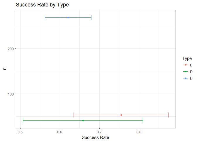 Figure 2 Success Rate by Type.
The snapshot of the data tells us that D has a higher rate of Success than the U but the confidence intervals are extreme in comparison.
Lets also control for What was the dog doing pre-elimination? (nap, meal, walk, play, sniffing, pacing, etc.) and see if our results change.
test_elimination <- test %>%
  group_by(`What was the dog doing pre-elimination? (nap, meal, walk, play, sniffing, pacing, etc.)`) %>%
  summarise(n = n(),
            mean_success = mean(Success, na.rm = TRUE),
            std_error = sd(Success, na.rm = TRUE) / sqrt(n),
            sd = sd(Success, na.rm = TRUE),
            lower.ci = mean_success - qt(1 - (0.05/2), n - 1) * std_error,
            upper.ci = mean_success + qt(1 - (0.05/2), n - 1) * std_error) %>%
  filter(n > 2) %>%
  arrange(desc(mean_success))
test_elimination
## # A tibble: 6 x 7
##   `What was the dog ~     n mean_success std_error    sd lower.ci upper.ci
##   <chr>               <int>        <dbl>     <dbl> <dbl>    <dbl>    <dbl>
## 1 crate                  71        0.972    0.0198 0.167    0.932    1.01
## 2 nap                    27        0.889    0.0616 0.320    0.762    1.02
## 3 signal                 15        0.600    0.131  0.507    0.319    0.881
## 4 sniffing              215        0.553    0.0340 0.498    0.487    0.620
## 5 pacing                 14        0.429    0.137  0.514    0.132    0.725
## 6 play                   21        0.333    0.105  0.483    0.113    0.553
When Aimee is in her crate before going out she has the highest success rate.
Now we run a t.test for statistical significance between Success and Accident by date but before the test we will remove missing values (when Aimee had no action but was taken outside).
test <- test[c(-56, -15), ]

hypothesis <- with(test, t.test(Success == 1, Success == 0))
hypothesis
##
##  Welch Two Sample t-test
##
## data:  Success == 1 and Success == 0
## t = 8.1307, df = 724, p-value = 1.85e-15
## alternative hypothesis: true difference in means is not equal to 0
## 95 percent confidence interval:
##  0.2194118 0.3591006
## sample estimates:
## mean of x mean of y
## 0.6446281 0.3553719
obs_diff <- hypothesis[["estimate"]][["mean of x"]] - hypothesis[["estimate"]][["mean of y"]]
obs_diff
## [1] 0.2892562
Successful housebreaking trips are achieving at 0.6446281 while accidents are occurring 0.3553719. That’s a 0.2892562 drop, which is great if it were true. The most likely reason for weird difference in means results are that we didn’t collect enough data.
Lets plot the p-value by date.
test_by_day <- test %>%
 group_by(Date) %>%
 summarise(p_value = t.test(Success == 1, Success == 0)$p.value,
    Success = t.test(Success == 1, Success == 0)$estimate[1])

test_by_day %>%
  ggplot(aes(Date, p_value)) +
  geom_line(size = 1) +
  geom_hline(yintercept = 0.05, linetype="dashed", color = "red") +
  labs(title = "P-Value of Success by Day",
          subtitle = "With 0.05 Threshold") +
  theme_fivethirtyeight()
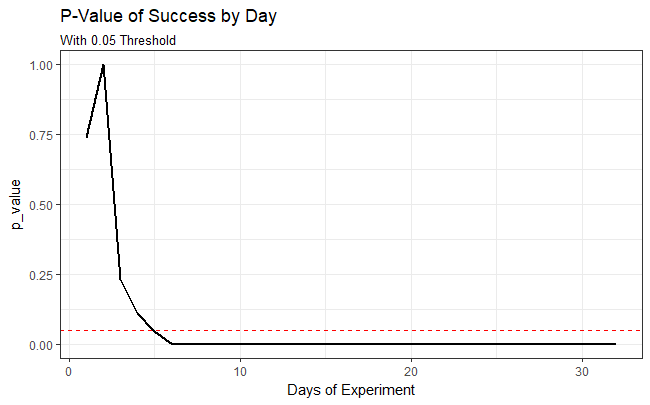 Figure 2.1 P-Value of Success by Day.
The difference in means is statistically significant at the conventional levels of confidence. As the p-value is larger than our 0.05 significance level, we can reject the null hypothesis that there is no statistical difference in Success vs Accident for housebreaking Aimee. This type of statistical test is useful for me to determine whether housebreaking Aimee resulted in a statistical difference of Succcess.
Lastly we can calculate the effect of success over time and the total effect of success.
test_by_acc <- test %>%
 group_by(Date) %>%
 summarise(Accident = t.test(Success == 1, Success == 0)$estimate[2])

effect <- inner_join(test_by_day, test_by_acc, by = "Date") %>%
  mutate(effect = (Success - Accident))

effect %>%
  summarise(mean_effect = mean(effect), total_effect = sum(effect))
## # A tibble: 1 x 2
##   mean_effect total_effect
##         <dbl>        <dbl>
## 1       0.315         10.1
Lets plot the effect overtime for visual ease.
effect %>%
  ggplot(aes(Date, effect)) +
  geom_line(size = 1, color = "blue") +
  labs(title = "Percent Change of Success by Day") +
  theme_fivethirtyeight()
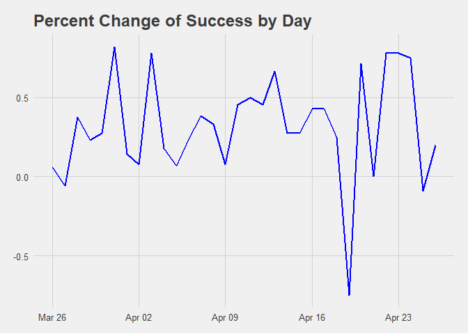 Figure 2.2 Percent Change of Success by Day.
Final hypothesis
My final hypothesis is that Aimee is more accident prone later in the day.
ggplot(data = test, aes(`Potty break or in-house accident?`, hour)) +
  geom_boxplot(color = "#007DC5", alpha = 0.8) +
  geom_jitter(size = 0.5) +
  theme_bw() +
  labs(x = "",
    y = "",
    title = "",
    subtitle = "Box Plot of Potty break or in-house accident? by Hour") +
  coord_flip()
 Figure 2.3 Box Plot of Potty break or in-house accident? by Hour
qplot(fill = `Potty break or in-house accident?`, x = hour, data = test, geom = "density",
      alpha = I(0.5),
      adjust = 1,
      xlim = c(-5, 30)) +
  theme_bw()
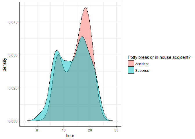 Figure 2.4 Density Plot by Hour
hour_t.test <- with(test, t.test(hour ~ `Potty break or in-house accident?`))
hour_t.test
##
##  Welch Two Sample t-test
##
## data:  hour by Potty break or in-house accident?
## t = 2.1031, df = 296.87, p-value = 0.0363
## alternative hypothesis: true difference in means is not equal to 0
## 95 percent confidence interval:
##  0.07694935 2.31919455
## sample estimates:
## mean in group Accident  mean in group Success
##               14.86047               13.66239
As the p-value is smaller than our 0.05 significance level, we reject the null hypothesis that there is no statistical difference in the hour for Potty break or in-house accident?. This type of statistical test is useful to determine if the hour of the day resulted in a statistical difference in success. This means that if the data is continued to be collected using the same techniques, 95% of the intervals constructed this way would contain the true proportion and will fall within the interval estimates 95% of the time. Examining the box plot above gives a easy visualization of our confidence interval for the true proportion of the sample.
hour_diff <- round(hour_t.test$estimate[1] - hour_t.test$estimate[2], 1)
Our study finds that hour of day, on average is 1.2 hours later in the Accident group compared to the Success group (t-statistic 2.1, p=0.036, CI [0.1, 2.3] hours)
Conclusion
To clarify, I am not a professional trainer but thought using data to measure whether or not my pup was progressing in the right direction seemed amicable. Also, I used no form of punishment and strongly suggest the reinforcement method of using a clicker. Learning that punishment does not work because they don’t remember the act of going to the bathroom in the house is key to only using positive reinforcement. If you scare your animal while catching them in the act it will only cause them to be afraid of you when they have to potty and will lead to finding hidden accidents.
Now for the data conclusions, using a schedule and rewarding good behavior was key to the quick learning results while housebreaking.
Remember that correlation is not causation. The later it is in the day is not causing Aimee to have more or less success with housebreaking. It is more likely due to both my partner and I being home and present while being able to pay more or less attention to her behavior.
In the future we could also use the food and water data I collected to help with determining variables in housebreaking. Animals that eat/drink on a set schedule tend to use the bathroom on a schedule. Another useful variable may have been to group by Date and calculate the average time between potty trips to gather a general pattern. A good data analysis always generates insights but also helps generate more questions.
 Figure 2.5 Aimee